The mobile website I built Office Depot received a perfect score from Keynote Systems, but that doesn’t mean it’s perfect. There is always room for improvement. When it comes to peak performance even small gains can make a big difference.
What’s wrong with this picture?
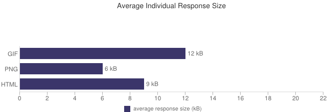
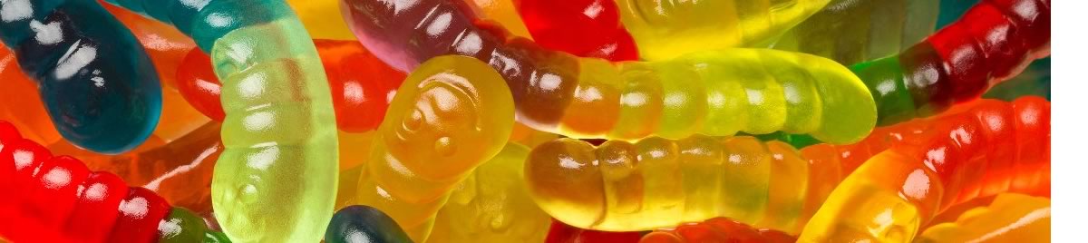
At first glance it seems okay. The site checks in at a lean 52k, and 35k isn’t excessive for images. It’s all in the way you look at it. It reminds me of a similar experience I had a while back. I came out of the grocery store and looked at my receipt. The most expensive item was $17. That’s not a lot of money. But it was for gummy worms, not real food. Looking at that 12k gif I realized it was the gummy worms of our mobile website. That gif was about a third of the total image load and almost a quarter of the total page weight. It had to be a gif and it couldn’t be included in our sprite because it was animated.

Ajax loading animation
This had to be set as a background on our template body to make sure it was preloaded because the server actually took longer to load it the first time than it took to return the data from the ajax request!
Replacing this gif presented an interesting challenge. We could have gone to a a static text message that just said “Loading…”, but we didn’t feel it gave the user enough feedback that something was actually happening. My first thought for a replacement was a CSS3 animation, with a HTML5 canvas implementation as a backup plan. It’s a natural reaction to look to the latest technology to solve a problem. But both of these options require quite a bit of code and they can have an impact on the phone’s battery life, depending on how they are handled. Using CSS3 animation still required at least one image.
I decided to start with the simplest solution I could think of and work my way up in complexity only as necessary. That proved to be a good approach.
I started with a simple HTML unordered list and I ended up with an extremely lightweight text-only alternative that used plain-vanilla CSS, HTML and native Javascript. Because my solution was based on text it looked great on all the devices, irrespective of pixel depth, and could be placed on any background color without having to worry about anti-aliasing. This saved about 11k and, more important, one HTTP request. But the best part is that it is attractive enough that the Business actually liked it better than the original!
[codepen_embed height=”175″ theme_id=”21122″ slug_hash=”josuf” default_tab=”result” user=”pixelslave”]See the Pen josuf by Connie Finkelman (@pixelslave) on CodePen.[/codepen_embed]