Design failures usually aren’t the result of one bad decision but rather a chain of mistakes that lead to an inevitable conclusion. It’s like the tale of the old woman who swallowed the fly (and then the spider, etc.) A single choice early in a design can be limiting or force choices later in the process that cause the design to ultimately fail, or to cause usability to be compromised. When I see something in a design that doesn’t work I try to trace it back to the decision that caused it, because that’s where it needs to be solved. In the work of inexperienced or mediocre designers, there are often a number of bad decisions at play. I’m going to look at a particular design I came across today because I think it makes an excellent case study on how bad decisions early in the design cascade to the finished result.
Bad decision 1: The color palette
The artist began by choosing a color palette for the website.

There is nothing wrong with any of these colors, per se. They make a nice modern palette. The designer got them approved and built the style guide around them. He was now locked into this palette.
The problem was that he was looking at how these colors worked together in promotional elements, in icons and ads.
He wasn’t looking at them holistically, in the context of the enterprise e-commerce site for which they were chosen.
There are two perennial problems with palettes on websites. The first is palettes that are too limited. For example, I’ve worked for two large organizations that had only one brand color and it was red. Since light red is the taboo color pink, you’re out of luck on tints. Any other color you put with red either looks like a Christmas tree or a flag. Bold, yes. Versatile, no.
The second problem is lack of acceptable button colors. In an e-commerce site buttons mean money, so it’s not something you can be casual about. For example, one company changed their button color and got a 44.11% lift in conversion. It’s that important.
In the color palette above there are only two colors that can be used for buttons. The red is out because in western cultures it means “stop”. Error messages are red. The pastel purple color is out as well, unless you’re a hair salon or an ice cream parlor. If that’s your main brand color you can get away with it. Otherwise it looks tutti-frutti—not serious or trustworthy enough for an e-commerce website. That leaves the blue and the green, and they’re both acceptable colors on their own. The problem is that they have to work together.
Every transactional website has primary actions, i.e. actions that lead through the purchase funnel, and secondary actions such as changing a stored address or saving an item to a shopping list. Color coding the buttons for these actions so that the primary flow actions always have the primary button color and the secondary actions have the secondary color helps the user focus on the main goal: purchasing from your website. That means your palette has to have two colors that look good together, but which also have a visual hierarchy, where one is clearly dominant. That is not the case in this palette.
The problem with this palette is that the blue is a stronger color than the green, but the green says “go”, which gives it a stronger connotation than blue. That puts them in competition with each other. You can see the difference in color “weight” if you look at them in gray scale.

If you put them side by side the user would have difficulty knowing intuitively which was the main action. The user would have to read the text on the buttons rather than making an automatic choice.

Here’s how that played out in the actual design for the shopping cart:
This isn’t ideal, but it isn’t terrible. The positioning and the differential in font size helps the checkout button assert itself. A better alternative might have been to turn the “Keep shopping” button into a link. The designer didn’t do this because he had made an emotional commitment to boldly expressing the new brand colors and liked the neatness and symmetry of sharp rectangular buttons, à la Google’s Material Design.
Bad decision 2: Missing the big picture
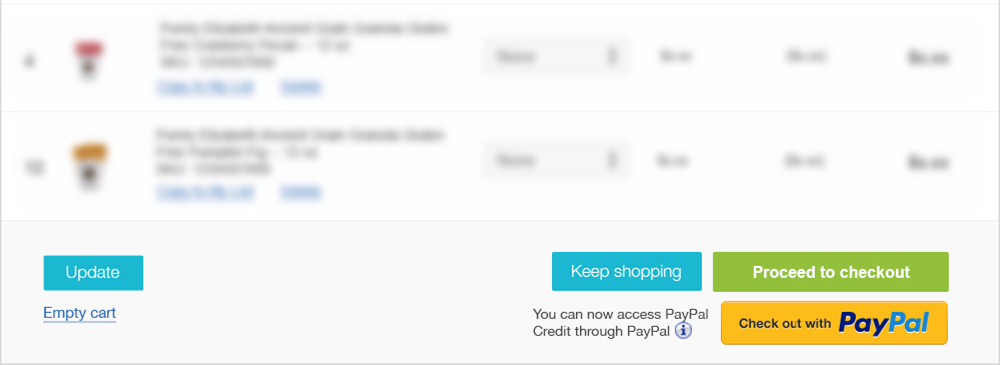
If we were only talking about two buttons the success or failure of this design might be a matter of personal preference and I wouldn’t be writing this blog post. The problem is that with a complex site there are always conditions. Unfortunately, inexperienced (or lazy) designers only treat what we call the “happy path”—the simplest use case with the most compact data. In the case of this shopping cart there is another major player to contend with: PayPal. When the designer embarked on this design the site was using an outdated version of the PayPal button, which was fairly small:
I think the designer should have been proactive and gone to the PayPal site to see what the latest recommended graphic was before proceeding with the design. After all, this lozenge style looks really dated. He didn’t. When he found out about it during the first design review he had to revise his design, incorporating the new (much bigger) button. It significantly impacted the layout:

One way to see the fundamental problem with this layout is to look at it in grayscale:

Which button is most important? You can’t tell just by visual weight. They all weigh in about the same. When the design is seen in color, PayPal wins. The PayPal button has more contrast, a more eye-catching color and more visual excitement. (As an interesting side note, it is the most dominant button when looked at with any form of color blindness. It actually gets stronger for the color-blind user. Well played, PayPal! They clearly don’t let artistic preference get between them and your dollars.) If the designer had set out to increase PayPal usage on the site this design would have succeeded. I suspect tablet users will often hit that button by mistake because of the small amount of separation between it and the checkout button. Since increasing PayPal usage was not a goal in this redesign, the obvious question is why these buttons are clustered so close together. It’s not because the designer wanted visual harmony—the opposite was achieved. The variation in button sizes and the misalignment of the grid reflects the fact that the PayPal button was retrofitted.
Every change made to a design should be evaluated in terms of the entire experience rather than viewed in isolation, because for a design to really work, everything has to be tightly integrated like a symphony. Everything has to be in exactly the right place, and in the right relationship to everything else, not shoe-horned into whatever space is available when the decision is made to add it. Inexperienced designers often have difficulty recognizing the point when revisions have invalidated the original design and they need to go back to the drawing board.
Bad decision 3: Holding on to a failed concept
The problem of the cluster buttons could have been solved easily by injecting space or separation between them:

There are only two reasons I can think of for the designer not wanting to separate these buttons: He didn’t see the problem caused by diminishing the importance of the checkout button or he refused to embrace the solution. I think it was the latter: He had made an earlier design decision that forced him to cluster the buttons and he didn’t want to unwind it and start over to find a better solution. That earlier decision is hinted at in the the gray background color behind the buttons. This design is based on a compact gray footer area below the shopping cart where everything was neatly tucked in:
If this footer area were taller, the designer would have had to rethink the balance of every element inside it, and he would have ended up with a very different visual effect—one that was no longer as discrete and compact. The area of gray would have grown to a height that might call attention to itself as an independent element, rather than a sub-element of the cart table, he’d have an expanse of lifeless gray on the page, and the vertical rhythm of the design would have been altered. He might have had to start over on the design.
I did the minimum required to salvage this piece. First, I looked at usability. Following PayPal’s example I gave the checkout button a starring role, both by adding more visual excitement to it in the form of an arrow and diminishing the buttons around it. I chose a smaller PayPal button from the six different sizes they offer. Next I got rid of the PayPal Credit message. PayPal Credit makes money for PayPal and they advertise it enough already on their own site. Unlike the original designer of this piece I have no problem making the footer area taller. It has the added benefit of putting more space between the cart “Update” and the “Empty cart” actions—a benefit to touch screen users. I would also have gotten rid of the gray background and let the buttons stand naked on a field of white for maximum contrast, but that’s a minor quibble. Here is the result of my quick fix:
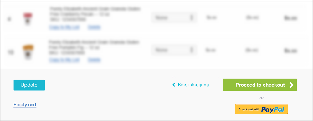
I think my revision is an improvement that will undo the damage to conversion (people buying rather than accidentally emptying their cart or getting lost over at PayPal), but it’s not a brilliant design. You can’t “fix” your way to a brilliant design. A brilliant web design is conceived and executed with clarity and skill from beginning to end by a designer in full mastery of their craft and the medium, guided by a desire to do what’s best for the user, rather than by personal taste or current fashion.