I’ve worked with a lot of designers over the years, and there are things they all seem to do that make my job harder than it needs to be. I blame Photoshop. Here’s a short list:
1. Name That Hex
Instead of just assigning a hex value to text the designer starts with a color and applies opacity until they get a tint that looks right to them. When I sample it for use in CSS (even if I use Photoshop’s CSS export) I get nothing near the perceptual color. Worse, because every instance is eyeballed I might see a dozen different yet indistinguishable variations of a color on a page.
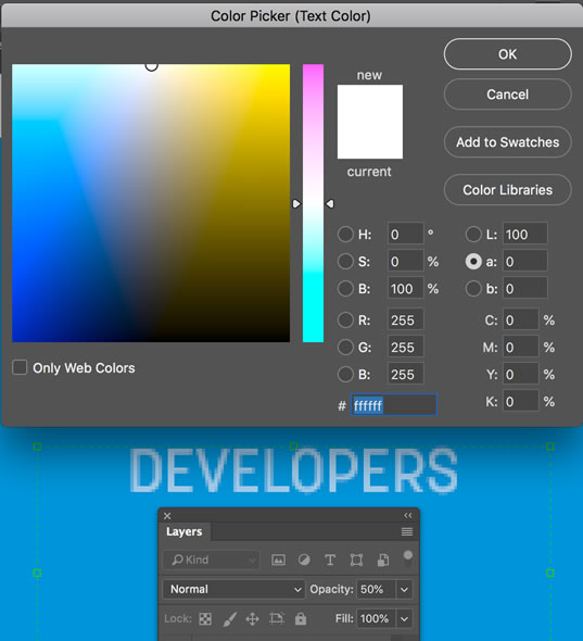
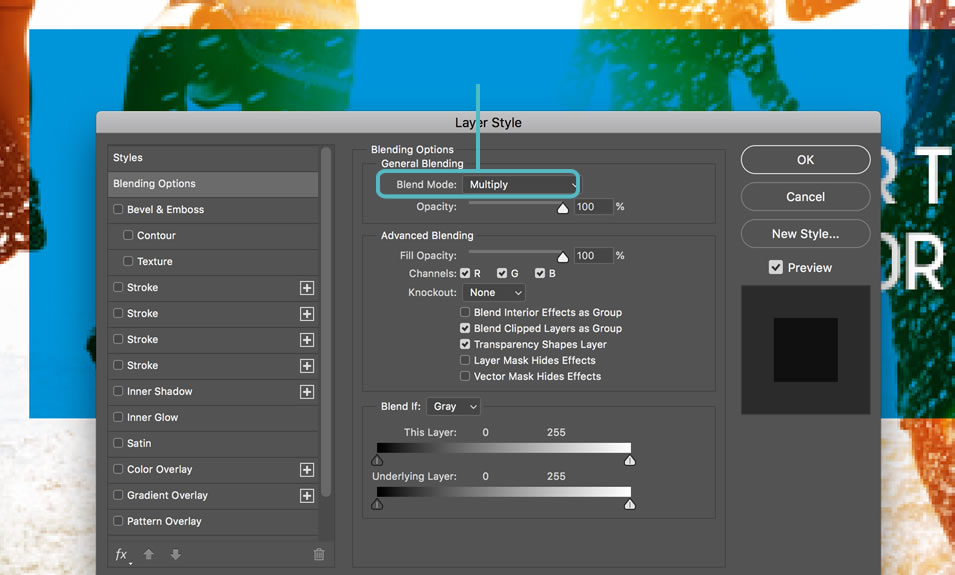
It’s worse with gradients. In one particularly crazy incident, I took the color shown in a gradient and it wasn’t right. Then I saw that the opacity for the gradient was set at 40%. I adjusted accordingly but it still wasn’t right. Then I noticed that the rectangle the gradient was applied to had a multiply filter on it… and the layer it was in had an opacity setting. Sheesh! I just exported it as a flat png and did the best I could using the eye dropper to recreate it.
A variation of this is when the designer uses a blending effect that isn’t available on the web, such as “multiply”.
2. Text Fantasies
Designers spend a lot of time thinking about what font they’re going to use and how the text content works with their design. Yet most seem not to have taken the time to really understand how text works on the web. I think the first thing they should do is put a rubber band around their wrists and every time they start kerning and inserting line breaks to keep from having orphans they should snap the rubber band on themselves to remind them that on the web text flows, and what looks perfect on their monitor won’t look the same on everyone else’s monitor or on a tablet.
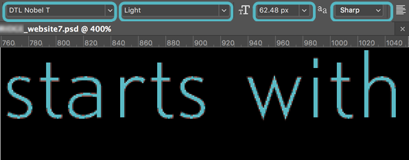
I think about ten years ago designers heard the message that custom fonts are now usable on the web, then didn’t stick around for the rest of the conversation—you know, the part where licensing was discussed and how CSS actually handles text. Most don’t realize that not all fonts that are available for web use have been optimized for web rendering. Lack of web optimization can cause a font face to look much clumsier in a browser than it does on the desktop, and they can be significantly heavier in some browsers than others.
Another problem with rendering of fonts on the web is that even fonts that are for web use might only be optimized in even sizes, so 13px and 15px (which I’m seeing a lot of lately) don’t look as good as 12px and 16px.
There is also the fact that browsers use only integers, not decimals in sizing fonts, so they will round up or down if the font size is specified as percentage or decimal. I haven’t tested this recently, but last time I did, browsers varied in where they rounded, meaning that you could get different sizes on different browsers.
There are thousands of fonts, but the two most popular with designers seem to be Myriad and Helvetica. Myriad, Photoshop’s default font comes in, well, a myriad of styles and weights, as does Helvetica. Designing with these and other professional-grade fonts presents several problems. If a designer specifies a font that is not virtually guaranteed to be available, like Arial, for example, the user must have that font on their computer or the page will have to provide it as a linked file. Although designers typically have a huge selection of fonts, the typical user does not. Taking the example of Myriad and Helvetica, the former is typically only provided with the Adobe Creative Suite, and the latter is rare on non-Mac computers. If a designer specifies a premium or unusual font, the developer will have to link to or import the font file into the web page to keep the design intact. Premium fonts are rarely free for web use and are generally billed by page views, meaning these could become quite expensive on an enterprise website. If a design uses many different styles and weights, loading these font files to the page can affect page load and performance. But if the fonts aren’t available to the browser, there is no fallback, since generic browser-friendly fonts like Arial and Tahoma do not have the weight and style options common to premium fonts. Nothing ruins a design faster than substituting Arial regular for a Helvetica Neue Condensed Light.
I think the majority of these issues stem from Photoshop itself which, being a generalized design tool, offers designers options that have no parallel in a web browser. For example, Photoshop lets designers believe they can control the antialiasing of web text by giving them the choice of sharp, crisp, strong, and smooth.
3. Magic Numbers
Because the web is responsive now, content element widths have to be specified as percentages. I’m happy using any ratio that comes out to a whole number below 10. I’m not happy when the proportions are three digit prime numbers. I’m simply not going to specify widths of 48.7% and 51.3% for boxes or columns. And I get especially peevish when similar structures on the next page are 46.1% and 53.9%. Why not just use a grid? Which brings me to the next gripe…
4. Gridbusters
I think nothing makes me crazier than opening the Photoshop comps where the first layer is a grid overlay and seeing how badly it’s been abused and ignored. If you can’t get your design to align in a 12-column grid you’re just not trying.
4. Sloppiness
As a final note, there is one thing that always signals to me that someone is not really a web designer. Unlike traditional-media designers who may pass their work onto the next stage as a PDF, web designers hand off their original Photoshop files to a developer. Real web designers take the time to make their files organized, complete and readable. Even more than that, they are in the habit of working as if someone else will be sharing their files. In the years I’ve worked as a developer I’ve seen many Photoshop files by many so-called professional web designers. But I’ve only once been given a Photoshop file that really took into account my needs as a developer. In that file, all layers were labeled clearly, no unused layers were present and there was an extra layer at the top that had written instructions in it that overlaid the design, providing clarification on how non-static elements were to function. Most files I get from designers don’t even show rollover states.
The bottom line for designers is that if you want your design to look beautiful on the web you have to take the time to understand your medium rather than relying on the options Photoshop provides, and take some time to understand how browsers and web developers actually work.